Showing posts with label Huesday - Tuesday. Show all posts

Tuesday, February 05, 2013

Huesday- Tuesday / Tickled Teal

Robin Dodd Photography
Found on  Etsy

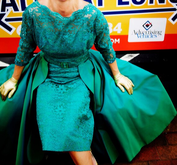
This month I am looking at Teal. I once had a living room painted in a dark teal and it was so dramatic at night.

What is Teal ... Teal is a low-saturated colour, a bluish-green to dark medium, similar to medium blue-green and dark cyan. It can be created by mixing green with blue into a white base, or deepened as needed with a little bit of black or gray colour. The complementary colour of teal is coral. It is also one of the initial group of 16 HTML/CSS web colours formulated in 1987. Its name is derived from the Middle English tele, a word akin to the Dutch taling and the Middle Low German telink. As a color, its name is believed to have been taken from the small freshwater Common Teal, a member of the duck family whose eyes are surrounded by this color.

 Teal is one of those shades that many people can confuse. I am often surprised to find people calling baby blue teal sometimes. I like to think of Teal as Aqua's dark brooding cousin. Where as Aqua and Turquoise are always ready for a party, Teal is much more likely to hit the streets late at night after the party is over. Teal is dark, rich and smoldering. Teal will not ask you questions that you can not answer and Teal is totally indifferent to your problems.
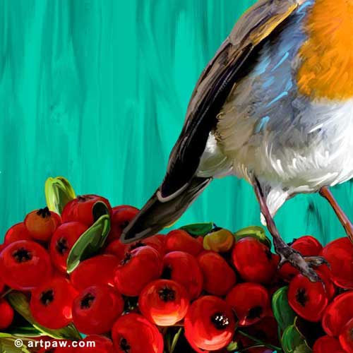
 Teal rhymes with steal and that is just what this hue will do when you combine it with warm golds, oranges or reds ... it will steal the show.

Later this month I will be creating some new teal backgrounds here at Art Paw and will post some new dog portraits that take advantage of Teal's drama.

I started a board over at Pinterest for teal that you can follow.


Tuesday, January 29, 2013

Huesday-Tuesday / Red & Green

"Bird & Giant Berries"
© rebecca collins / artpaw.com

Complimentary colors are those opposite each other on the color wheel. Red & Green are my absolute favorite complementary colors. They just make each other pop. Often people are afraid to combine these colors because they think that they look like Christmas. While it is true that a pure Kelly green and a cherry red may look a little bit like a Christmas tree, the reality is there are tons of dirty shades of green and deep blood reds that can combine to create pure magic.  Today I will post a few of my digital paintings that take advantage of the power of Red & Green.

"Dezi the Bulldog"
© rebecca collins / artpaw.com
I love the colors above in the background, the green is so sour and yellow it is almost a gold.

"Big Tommy & Ball"
© rebecca collins / artpaw.com

This is one of my favorite works I did of our Big Tommy. The lime green ball at the top right makes this piece pop. It gives it an action and a story.

"Beetle sketch"
© rebecca collins / artpaw.com

The Beetle sketch above almost vibrates due to two different complimentary color duos,  red & green are bouncing off of each other and also the purple antennas are playing off of the yellow background.

Tuesday, January 08, 2013

Huesday - Tuesday / Red

"Seeing Red"
My Inspiration Board on Pinterest


I started a Red Board today over at Pinterest. Red is one of my favorite colors and yet I have done boards for pink, blue, orange, and yellow before I even thought of tackling red. I think I prefer red off-line more than on. It is so strong and often hard to photograph.  I have found some yummy examples though.  Check out my pins and follow me on My Seeing Red Board.

I am still waiting for my book about the history of red to arrive from Amazon ... maybe next week I can share some facts on pigments and dyes with you.

My own thoughts on The Color Red:
Red can be a sledge hammer and honestly who does not want to throw down a sledge hammer every once in awhile. Red is an exclamation point, it seldom whispers, it is full of attitude and strength. You can try and class it up a bit with white, grey and black, but at the end of the day it is still going to be red. You never have to wonder about it ... it will not pretend. As gregarious and overly demonstrative as it can  be ... red will never cheat on you.

I use a lot of red and warm tones in my work.  Often clients will request reds when ordering a pet portrait for a man. It is a masculine color I guess, although I think of it as pretty gender neutral.

Artist Quotes About Red:

"A thimbleful of red is redder than a bucketful. " - Henri Matisse

"I love red so much that I almost want to paint everything red."--Alexander Calder

"My mother warned me to avoid things coloured red." -  Claes Oldenburg

"Red protects itself. No colour is as territorial. It stakes a claim, is on the alert against the spectrum." - Derek Jarman

" I want a red to be sonorous, to sound like a bell. If it doesn't turn out that way, I add more reds and other colors until I get it." - Pierre-Auguste Renoir

"You can't go wrong with the use of red; every painting should have red in it." - George De Groat

"A good painter needs only three colours: black, white and red." - Titian

"What I love most about red is green." - Rebecca Collins