Friday, March 30, 2012

Flashback Friday/ Old Web Design

I always tell artists that are thinking about setting up a site that they just have to dive in and do it. If they can afford to throw money at it and hire a pro to help them all the better. If you wait until all of your photographs are perfect or until you have a chunk of time to focus on it, well you will never get it done.

5 Things to keep in mind when starting your very first website:

• Your first site is going to suck compared to the site you create 5 years from now, get over it.
• If you do it yourself there will be a learning curve, just be patient.
• Websites are like hair-dos, we hope you are not still wearing your same hair from high school. Sites are meant to change over time.
• You might try using the templates and tools available through sites like wordpress.com and template monster.
Avoid Comic Sans!!!! Don't believe me ... see my first site design below.... ugh.

Jan. 2000
I started Art Paw in 1998, my first site happened in 1999, and this screen shot, taken from the 
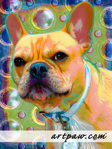
internet archive is from Jan. 2000.  How many things did I do here that I now hate ...hmmmm well to start with comics sans font and dark text on dark color. The sweet boy shown on the page was not a mistake ... that is my Atticus.
June 2000
 Looks like I gave my self a face-lift in the summer of 2000, lightened things up, but still had Comic Sans and no real logo. Sometimes images don't display right with the archive tool so that is what the blank spots are about.
December 2000

By December of 2000 things were starting to take shape and I ditched the Comic Sans, designed a logo and got my main menu over to the left which was becoming the standard placement in web design. Wow, 2 major design changes in one year.  I did like playing with web design back then.
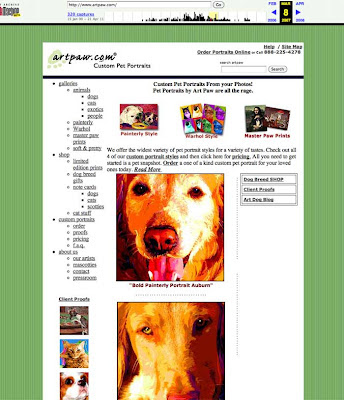
March 2007
The screen shot above is from 07, and I had a reworked logo that I am still using today, a green striped background that I used for many years, and you can not tell from this shot as it did not display properly but the menu to the left was actually a groovy fly-out menu that looked better than the text links you see.  I added a search feature at the top right, got my toll-free number up there and a sitemap. I used this design for many years.
Nov. 2010
This is from November 2010, and other than the snowflake bling in the left menu this is pretty much my site today. Probably time for a design change again, but I really do not know when I will find the time, oh yea I said no excuses.  Yea, well..............

Thursday, March 29, 2012

Horse Art

"Gonzo & Vinnie" ( see all proofs)
© rebecca collins / artpaw.com

"Gonzo & Vinnie" ( see all proofs)
© rebecca collins / artpaw.com

 This week I got to play with a couple of stunning horses. An old college pal contacted me to create some artwork for her sister.  I have created artwork of horses before, but this is my first 2-horse portrait.
About The Artwork: I combined two different images of Vinnie, the brown horse in order to create this portrait. The image with the human had the best detail on the brown horse-head and the head was facing the right way so I took it and placed it on the body from another pic (after flipping the body shot side to side, so the body faced the right direction). It was important to have the head facing the right  way to start with because you can not rotate or flip a photo of an animal with unique markings, as it will not read correctly.
About Composition: It is always a challenge to combine multiple pets into one project. I instinctively placed the white or light grey horse to our left because we read from left to right. It made the most sense to have the darker animal to the right where our eye would finally rest, that shape is heavier due to the darker hue. Vinnie is also engaging us more with his face towards us, so again, it makes the most sense to have our eyes rest at the right on that horse.  The leather harness straps on Gonzo make some nice negative space shapes and they break up the background well giving him some more movement and interest. I am pleased and can not wait to see this large 24 x 36 inch portrait printed up next week. My friend chose the first sample above with the wooden background ...  the wood is a photo-shopped image of a door I shot in Italy last year. The graffiti wall below it is also from Italy and makes for a funny horse in the city vibe.

Tuesday, March 27, 2012

Mister The Corgi

"Mister"
34 x34
© rebecca collins / artpaw.com

Last month we shipped out a special memorial portrait for a sweet Corgi boy named Mister. When the order was placed I had a nice phone call with my client and got a good idea of this character's fun personality. He reminds me a lot of my Big Tommy.

I don't always hear from all of my clients after the projects ship however it is always a treat when I do. I often work alone in the studio so when happy e-mails arrive in my in-box it makes my day.

Thanks Kathleen  for letting me play with your big eared boy and for your very kind words ....

"Mister came today and he is just fabulous!  We pulled him out of the box, propped him up on the mantle and we just stood there staring.  Literally.  Neither of us had any words for that moment.  It was a moment to be felt, not discussed.  It was awesome.

You did such a great job.  His eyes are just spot on and the hole in his sock is really special.  That whole foot almost looks 3D, like it's just popping right out at you.  And you took out just enough gray.  He looks so perfect!

Thanks so much.  Kathleen"

Monday, March 26, 2012

Mosaic Monday: Cats, Chickens, Chatoyancy

I learned a new word recently ... My friend Katrina Doran used it this last month when she was installing a residential commission she did for Joyce, one of her dear friends and local patron of the arts.


Chatoyancy: the condition or quality of changing in color or luster depending on the angle of light, especially of a gemstone that reflects a single shaft of light when cut in cabochon form.

Is that a great word or what?

Mosaic Field Trip ...
So a couple of weeks ago I played hooky on a Monday and watched Katrina work as she installed a lovely mosaic back splash she did of a calico and chicken. It was a perfect spring day and I even got to help a little bit with Joyce's chicken coop mosaic project. Joyce's home is just lovely and everywhere you turn there is an original mosaic by somebody famous in the mosaic community.  She has taken on a personal project of covering her chicken coop and I was eager to help as I have my own plan to cover one of my art sheds in tile later this summer.  I tease her that I plan to learn from her mistakes. So far however she seems to know exactly what she is doing, so I guess I may have to learn from my own mistakes.

Pics below show Katrina Doran's mosaic kitchen installation, and also the chicken coop fun outdoors. So one long Monday... two different mosaic projects, and I got to be a fly on the wall so to speak.

© 2012 Katrina Doran
Back splash
Prep work: trimming substrate edge for snug fit
Drilling into place: Katrina is giving a diagram to her client showing screw locations so if the piece ever needs to be moved it can be.
Grouting
Outside the chickens watched on as Joyce, Judy, Katrina and I worked a little on the coop. It was a long mosaic filled day.
Fancy Chicken Coop
Flowers mosaics are by : Tricia Van Buskirk, Katrina Doran and Joyce Ward.

Thursday, March 15, 2012

Zelda Bunny Chihuahua

"Zelda Bunny" ( see all proofs)
© rebecca collins / artpaw.com

This is Zelda. Some of you may recall Topaz the Chihuahua from a few years back. Topaz was a one of our few celebrity pups ... a project for singer Jerry Lee Lewis. His daughter ordered a portrait as a gift for her Dad and now we are lucky to get to her very own pooch. 

Tomorrow I will post a very special Corgi named Mister. We have lots of great projects in house right now, stay tuned for more art posts soon.

Wednesday, March 14, 2012

Cow Dog & Kitty

Lexi & Misty ( see all proofs)
© rebecca collins / artpaw.com

This lovely pair of pets will ship off to Canada as soon as my client approves their favorite proof. Love that adorable nose on the cow dog!
We are starting to get very busy this month. YAY!

Monday, March 12, 2012

Mosaic Monday/ New Website

Well, I can put it off no longer. Time to redo my personal website portfolio. I have tons of newer work that needs to be added to the site and I realized I do not really want to mess with html anymore unless I have to. I will keep using dreamweaver and html for Art Paw, however I am switching my design and layout on my Mosaic site (rebeccacollins.com) to a wordpress theme, and I look forward to being able to update it quickly once I have the learning curve down.

I found a theme I really like and now it is just a matter of shooting new work and updating the artist statement, and writing up a list of recent shows ... and so on and so on.
I should be done by the end of March.  Wish me luck!

http://rebeccacollins.com

Wednesday, March 07, 2012

Mountain Dog Portraits

This week I have proofed 2 different clients with Mountain Dogs. Potter is a Greater Swiss Mountain Dog and Roger is a Bernese. Sometimes the work flows in here like that, I will do several of one type of breed and then not see that breed again for a year or more. These big pups were a lot of fun to play with.

"Roger" ( see all proofs)
24 x 36
© rebecca collins / artpaw.com
"Roger" ( see all proofs)
24 x 36
© rebecca collins / artpaw.com
original photo
About Roger's Art:
This project will ship to Switzerland once the client approves their favorite proof. This was a fun project, the original photo was pretty good, I just had to brighten up the left side of the face a wee bit. The eye to our left was really hiding in shadow. This project is a large 24 x 36 and I played around a bit in the proofing round showing both a vertical and horizontal layout.

...........................................
"Potter"  ( see all proofs)
16 x 16
© rebecca collins / artpaw.com

"Potter"  ( see all proofs)
12x36
© rebecca collins / artpaw.com
"Potter"  ( see all proofs)
16x16
© rebecca collins / artpaw.com
Original photo
About Potter's Art:
The client originally ordered a long 12 x 36 painterly style portrait. This long skinny format is perfect for multiple pet projects however it often leaves a lot of blank background space when only one subject is shown. The 2nd sample of Potter above shows one solution I came up with for the design challenge and that was to play with text about the breed and a full body breed silhouette pattern. I also showed a 16 x 16 square option and that is the layout the client preferred. Friday we will ship out the last art sample shown above in this group.

Tuesday, March 06, 2012

Craving The Color Green

"Carlos"
© rebecca collins / artpaw.com
 I am hungry for the color Green ... it must be spring.
The color of the month for March is going to be green!
Last year I spent the entire year thinking about the color pink and worked with it a lot when creating my fine art mosaics. I chose pink because I was not a huge fan of it and wanted to learn to love it ... and it worked, I do love pink now.  This year I decided I wanted to focus on one color per month here at Art Paw and I am going to run portrait specials around a different color each month. I will have timed one day sales each week on the color of the month so if you are a fan of green be sure and follow me on Facebook so you can get in on the portrait promos this month.  I will post a sale link towards the end of each week over at Facebook. I will also be blogging on the color of the month each week, with bits of color trivia and other facts.


I am excited bout this color promotion as I plan to create many brand new color grounds each month to offer to folks that want to play along and order a portrait within the color theme.  Don't worry, I will still be working with all of the other crayons in the box so to speak, and you can order a non sale portrait in any hue you desire. The promotion is just a fun way for me to celebrate color and to really explore a different color in depth each month. It also allows me a little more color control in the design process, and I feel I will be able to push  myself creatively this way.  I do not mind taking very specific color directions from my clients however I have found that when I have run what I call " Artist Choice" promotions I really am able to play and experiment with my work and I always grow from those projects. 


About These Pet Portraits:
All of the projects in this post have some green in the background. Two of the grounds are old and two have been created in the last 6 months. I really love warm greens and even lime green can be fun when combined with other colors.


"Paisley"
© rebecca collins / artpaw.com
"Valentino"
© rebecca collins / artpaw.com
"Prada"
© rebecca collins / artpaw.com

Monday, March 05, 2012

Mosaic Monday: My Glass Shed

 Art Shed Makeover: Phase 1
Last Friday Lola and I got started on organizing my glass supply shed. Over the winter it has become a storage dumping ground and it was hard to get in there to find any sort of supplies. I enjoyed sorting glass and working on my own Saturday  putting things in order. Sunday my knight in shining armor showed up with power tools in hand to create a storage loft, and glass divider shelves, thanks Dan! We still have a lot more shelving to install and more sorting to do, however it is starting to look like a real mosaic studio.

Dan, installing shelf dividers
Storage loft, and hardware center below
The left side of shed is a wall of storage for stained glass and tile. I have a small work table for mosaics up front, and the right side of the shed will be organized for painting supplies, and print making supplies. We have an old small press that we plan to dust off this summer so we can do a few block prints.

I have a lot of tiny jars for beads and millie fiore, they will eventually be stored on tight shallow shelves that we are going to install in between the shed's support beams. I think it will create a lovely wall of color-candy.

We have about 4 lovely months here in Texas when we can actually work out in the shed-studio in comfort. After July, even with the air running it will be a bit hot and stuffy. I will post more photos soon once we finish our shelving work.

Friday, March 02, 2012

Flashback Friday/ My First Dog

Me and Pokey
This is me with my first pup Pokey, a sweet Beagle girl named after Pocahontas. I love these old printed snapshots, this one had a tear off portion for your wallet. Notice the dog house ... our pets lived in the backyard growing up, and that was normal back then.  Danny and I would never dream of leaving a pup outside overnight or even when we run to the grocery store. My Dad still has outside dogs, each to their own I guess, he treats them well and he sees after their vet needs, I know he really cares for them.  I am just so glad we were allowed to have pets growing up.

I love the double exposure shot above of Pokey & my Dad. Back in the old days of film you often would get to the end of the roll and if you kept shooting or there was a rewind mistake you could end up with a double exposure like the image above. Sometimes artsy photographers would shoot double exposures on purpose for interesting effects. If you do a google image search for Double Exposure Photography you will find some cool stuff. These days I do not know how you would be able to tell a real film double exposure from clever Photoshop effects, I suppose an old school photographer could tell the difference.

Thursday, March 01, 2012

French Bulldog Art

Napoleon ( see all proofs)
© rebecca collins / artpaw.com
Last month I donated a Gift Certificate to the French Bulldog Rescue network.  Napoleon's Mom won our certificate at auction and I got to play with her sweet boy Napoleon. He is such a cutie-pie. She picked proof #2, with the one of my new backgrounds. I am eager to see her project printed up next week.